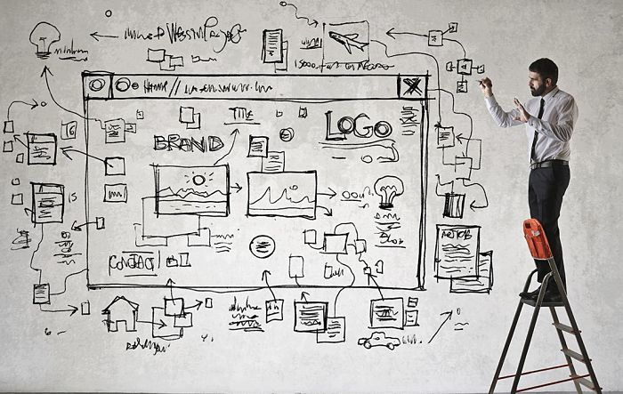
“We want to redesign our website to make it look up to date. Can you help?”
I’m sure that many marketing agencies hear this from time to time. We certainly do.
Just like fashion, what’s considered “cool” in website design changes frequently. Apple and Salesforce were once considered trend setters with their slick, engaging sites. But lately, website design has been heavily influenced by the proliferation of mobile devices, the introduction of Windows 8, and the adoption of social media tools. Those flat, monotone Twitter-style images are cropping up on the newer websites – replacing the shadowed and textured look.
The fact that more than 40% of website views take place on mobile devices calls for simpler, more intuitive website design – and better, faster ways to communicate with your audience. Your website is almost as likely to be read while in line at Starbucks, at an airport, or at the kid’s soccer game as it is to be read in the comforts of a home or office.
Today’s website has to balance the need for a quick scan on a mobile device and stand up to the in-depth scrutiny of a potential customer. It’s not an easy challenge to meet. So, here’s what we see in website design:
- Responsive design – creating websites that look just as good on smart phones as they do on desktop computers.
- Increased use of short, concise videos. We’re not talking about those seven-minute corporate pitches, but short focused videos where a customer’s question is answered or a client’s eye-view of a problem is featured.
- A clean and uncluttered look where the key point is made clearly and concisely. In other words – a website that doesn’t make the reader work too hard.
- A flat, clean design.
- Simpler color schemes―less complex shading and shadowing.
- Fewer banners, buttons and website tchotchkes.
“Infinite scrolling”―allowing devices to simply scroll down, rather than navigate across pages. - A move from defined side borders, which gives sites a boxy, squared look―to open views that show well on wide-screen monitors and mobile devices viewed sideways (such as the iPad in landscape mode).
- More infographics – the visual representation of information in the form of well-designed charts.
- Fewer custom-built websites and a preference for well-known tools such as WordPress.
- Less canned stock images – the smiling CEO, the manicured handshake, people in business suits running through fields, and the earnest soul writing flow charts on glass (and I’m personally happy to see the flow charts on glass take a back seat).
As the thumb continues to replace the mouse as a navigation tool, the way people read and assimilate information will continue to change. Few are willing to invest the time reading a 300-word webpage on a device that sits in the palm – they want the information delivered in short, sharp, content-rich bites. But at the same time, the content you publish still needs to satisfy those with appetites for more detail. But that’s a topic for another blog.