
Here are ten can’t miss tips for landing page optimization.
There are several types of landing pages, but for the purposes of this article, I’ll be addressing landing pages that are used to offer downloadable content, such as white papers. Landing pages are one of the basic building blocks of internet marketing. They are used to convert anonymous visitors to your website into leads. They are also used with email campaigns. The emails have a link in the body of the email and when the recipient clicks on the link, they go to the landing page.
Effective landing pages have one goal in mind. Get the user to take a desired action. Often, you want the user to fill out a form with their contact information in exchange for gaining access to a white paper or other type of content. The entire purpose of the page is to get the user to give you their contact information and click on a button. If they do this, that’s called a successful conversion. Landing page effectiveness is measured by the conversion rate of the page. What percent of the total visitors to the page fill out the form and click on the button.
What follows are ten can’t-miss landing page optimization tips.
1. Who is your target prospect?
Who is the ideal target prospect for this landing page? Who is your offer aimed at? Your landing page should be written with that target in mind. What are the common challenges for this buyer? What are their pain points. How does your offer help the target buyer with their challenges and pain points? The copywriting on the landing page needs to speak to your ideal target prospect and motivate them to want to download your content.
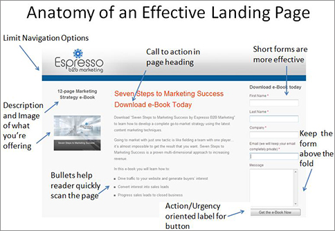
2. Keep it above the fold
Layout the landing page so that everything is above the fold (meaning that the user can see all of the content without having to scroll down). It you can’t do this, make sure that the entire form that must be completed, and the button that must be clicked are above the fold. Of course, the page heading has to be above the fold and most of the page text should also be above the fold.
3. The blink test
The page must pass “the blink test”, making it easy to scan to get the basic idea of the offer. Keep your sentences short and use 3-5 bullet points to tell the reader what they will get inside the download. This helps the reader quickly understand why they should accept your offer and click on the button. The bulleted sentences need to describe things that the prospect wants or cares about.
4. Keep the headline simple and include a call to action
The headline is very likely the first thing that the visitor will see and read on the page. If your headline is not clear many people will hit the “back” button on their browser. Keep the headline simple, make it action oriented and use a verb that clearly states what you want the reader to do. You should be able to tell what the offer is by reading the heading. Embedding a call to action it your heading helps with conversion rates.
5. Optimize the page for SEO
Each page must be optimized for search engines. This means doing the same things that you should do to optimize any other page in your website. You need to research and select a keyword for the page. Then, you need to insert that keyword into the six locations that we covered in our SEO presentation (URL, page title, meta description, meta keywords, Page Header (H1 or H2), and page text (at least once, and ideally twice).
6. Include an image that relates to your offer
Include an image on the page. If you’re offering an e-book or white paper, show the cover and possibly some of the other pages. You might want to include a caption above or below the image that says something along the lines of, “Download this Definitive 16-page e-Book”. This helps makes your report easier to visualize and more tangible.
7. Keep the input form short
Regarding the form and the required amount of contact information that you require, keep this to a minimum. Studies show that with each additional field that you add to the form, the conversion rate for the landing page decreases. The bare minimum is to require first name and email address. With this information, you can start an email nurturing campaign to that contact. Do you really need more than first name, last name, company name and email address? Think twice before adding extra fields to your form. Also, if you are requiring an email address or telephone number, be sure to include a message about your privacy policy and how their information be not be shared.
8. Limit the navigation options
Keep the navigation options to a minimum on your landing pages. You want the visitor to do one thing, right? You want them to fill in the form and click the button. So why display the menu to take them to the other pages on your website? That’s going to distract some visitors who land on this page. So do not include your regular menu. If you feel that you have to offer a way to your main website, limit it to a single button. Clear the clutter. Keep it simple.
9. Don’t overlook the label on the button
Regarding the label on the button that the user has to click, avoid labels like “Submit”, or “Click Here”. Instead, use action and urgency words, such as “Download Now” or “Get Your e-Book Today”. HubSpot, a marketing automation software company, conducted a study that revealed that landing page buttons labeled “Submit” have low conversion rates.
10. End each page with a call to action and a sense of urgency
End each page with a call to action. “Download Your Inbound Marketing Kit Today.” Try to inject a sense of urgency, by using words like “now” or “today” in your call to action.